
B2B Product Design · Advertising Platform · WPP Media
Segment Opportunity Simulator (SOS)
Lead Product Designer, end to end · Timeframe: Conception to MVP: 6 months · Team: Data Scientists, Engineers, Product Manager
Opportunity
A pitch story that only worked with a data scientist in the room
Segment Opportunity Simulator SOS started life as a WPP whitepaper called "The Consumer Equality Equation," which showed how ethnicity shapes the consumer experience. This paper predicted that ethnic minority heritage groups would double in UK markets, with rising disposable incomes to match. Data Science was continuously presenting this story in multi-million-dollar advertising pitches to existing and new clients in both the UK and the US and it was working. Clients wanted to investigate and engage with these demographic groups.
But informing clients of these opportunities only worked in one setting. A data scientist had to be in the room presenting it. Clients could see the opportunity to reach these growing audiences, but only during an advertising pitch. They couldn't go and explore the data themselves. Every bespoke model, every custom cut of the data, came through the Data Science team.
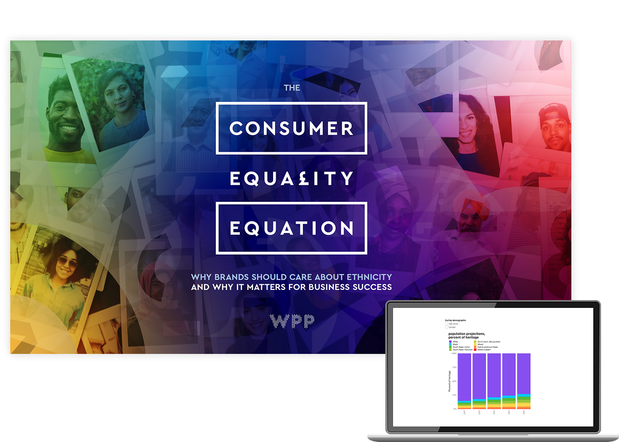
The Consumer Equality Equation whitepaper (placeholder data)
The Problem I Set Out to Solve (MVP)
Making the invisible opportunity visible and actionable
So I set out to design something a strategist could use on their own, without a data scientist sitting next to them. Nothing else in the company's offering did this. I wanted someone to be able to build their own scenario and compare groups by ethnicity, population size, age, sex, income bracket, and local geography, then see what those groups had been buying, and get a forecast of what they'd purchase or engage with next.
Who this product would be built for: Advertising Strategists, Audience Specialists, and Data Analysts.
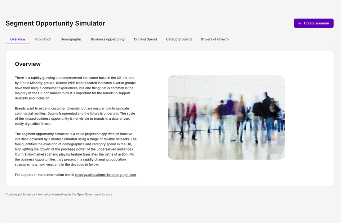
Overview tab describing the underserved consumer base
What I Led
Five interconnected design decisions that turned a pitch into a product
The following five design decisions didn't stand on their own. They worked together to transform a data story into a self-service product. Each piece informed the others, and removing any one would leave you with a data set rather than something a strategist could drive independently.
1. Product architecture: Tabs, over a vertical scroll.
Building narrative without overwhelming users
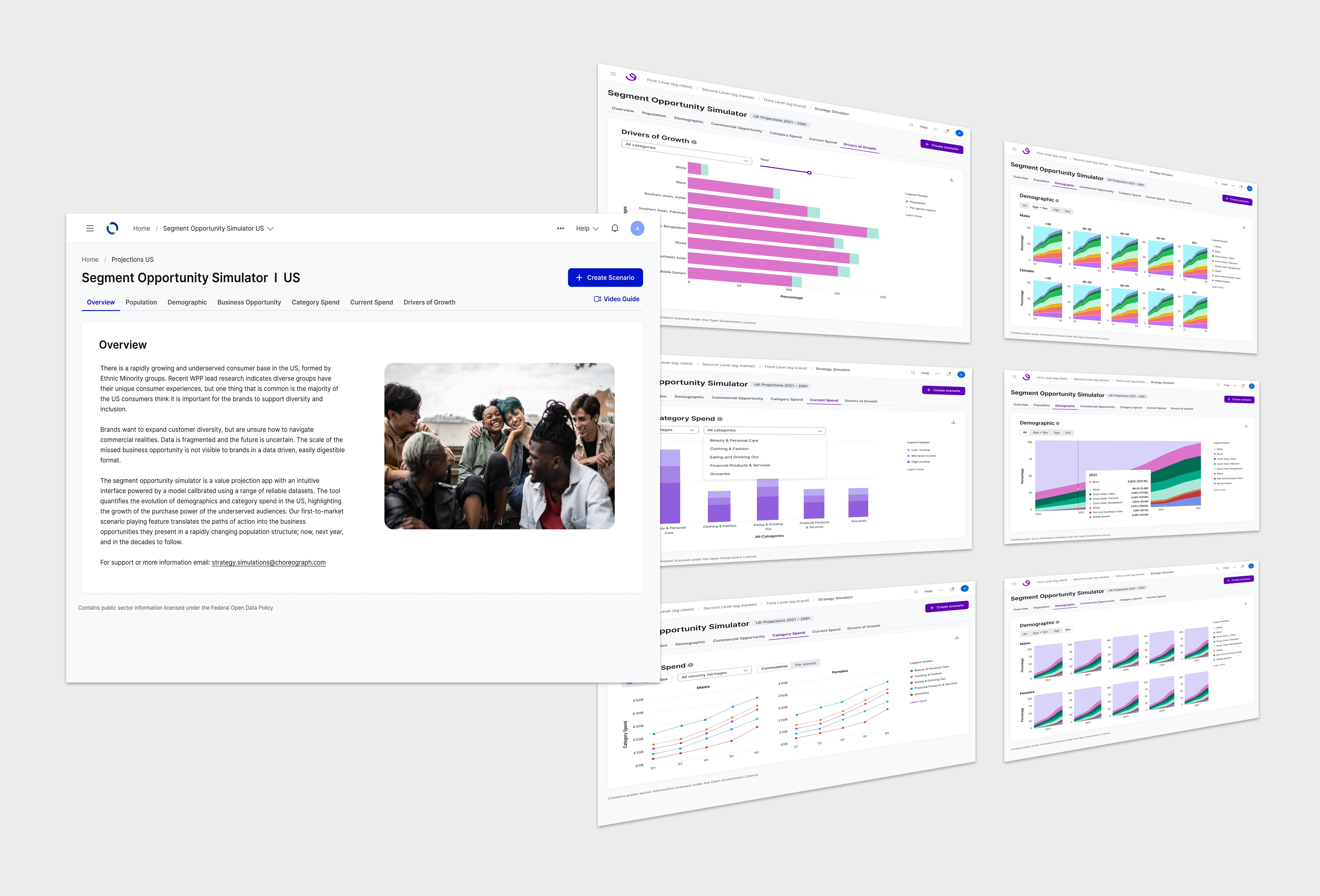
I wireframed and prototyped two structures. A tabbed layout and one long vertical scroll and put them up against the story the product needed to tell. Tabs won. They let each visualization build on the one before it (total population projections, demographics, commercial opportunity, category spend, drivers of growth) instead of dropping the whole model on someone at once. That call ended up setting the information architecture for both the UK and US versions.
Tabbed layout
Vertical scroll
2. A data visualization inventory.
Cataloging what worked, designing what was missing
The product was going to rely heavily on charts, so before designing anything new I went through every visualization that had ever been used in a pitch and asked what it showed and what question it answered. The audit made the gap between a pitch story and a product obvious, and from there I worked with Data Science to design the charts we would keep and the charts that were still missing.
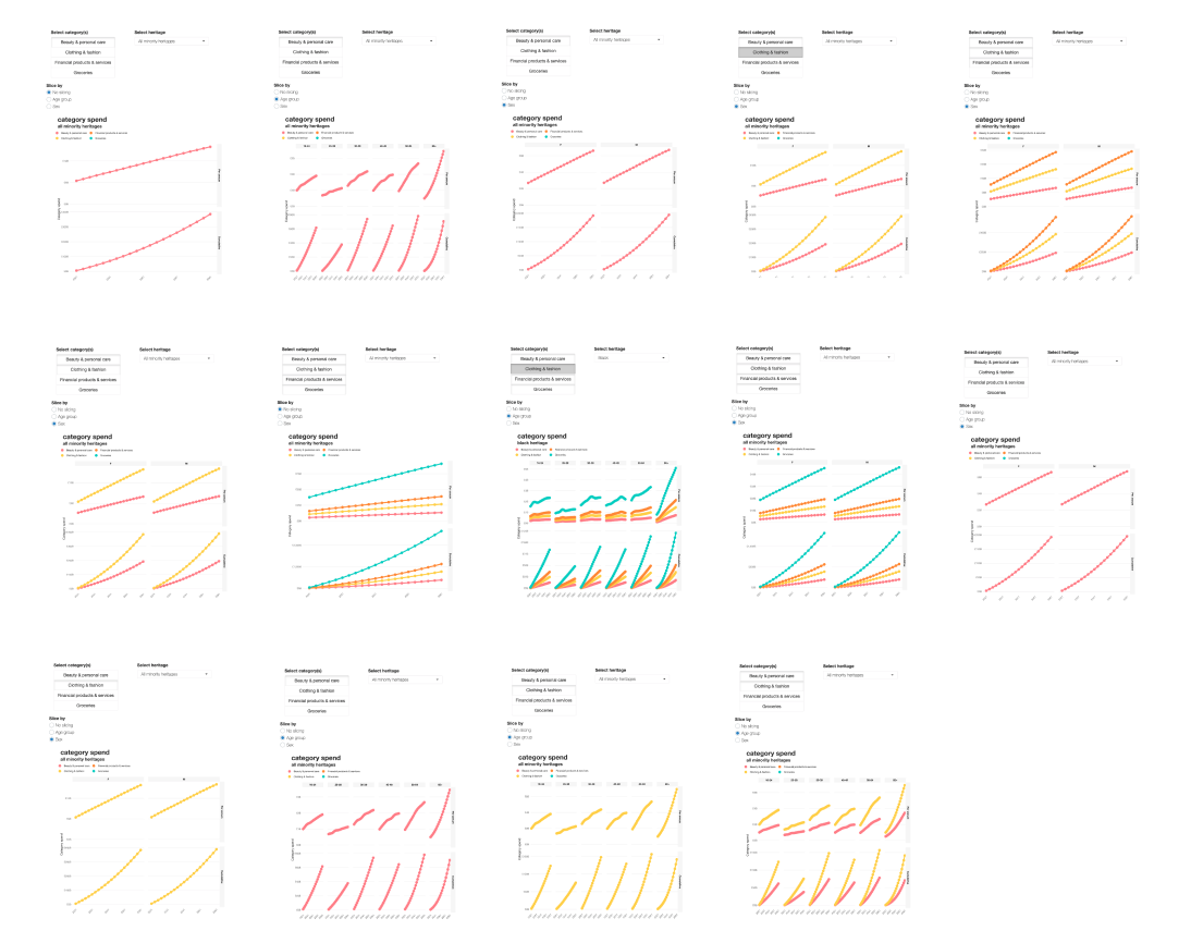
Data visualization inventory from advertising pitches
3. Charts built for cumulative results.
Chart types chosen to reveal patterns, not just data points
People needed to see opportunity accumulate, not just a snapshot in time. I chose chart types such as area charts, line charts and bar charts built to display accumulated data so growth could be displayed at a glance. Then I ordered them so each tab told a small story on its own, validating the broader picture all tabs shared.
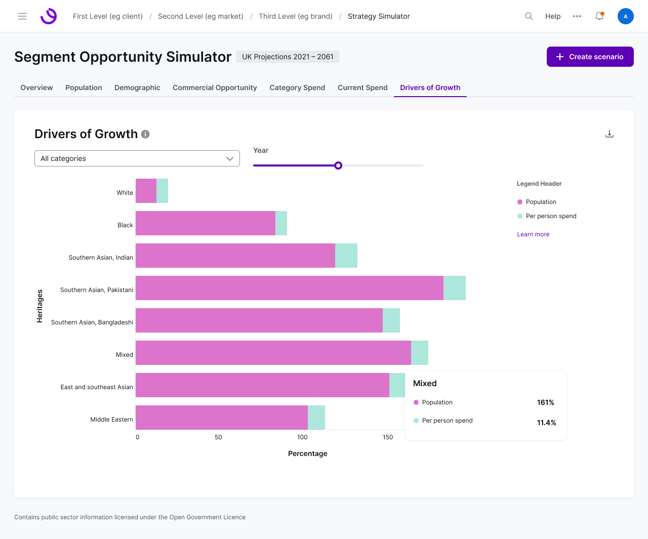
Drivers of Growth visualization (placeholder data)
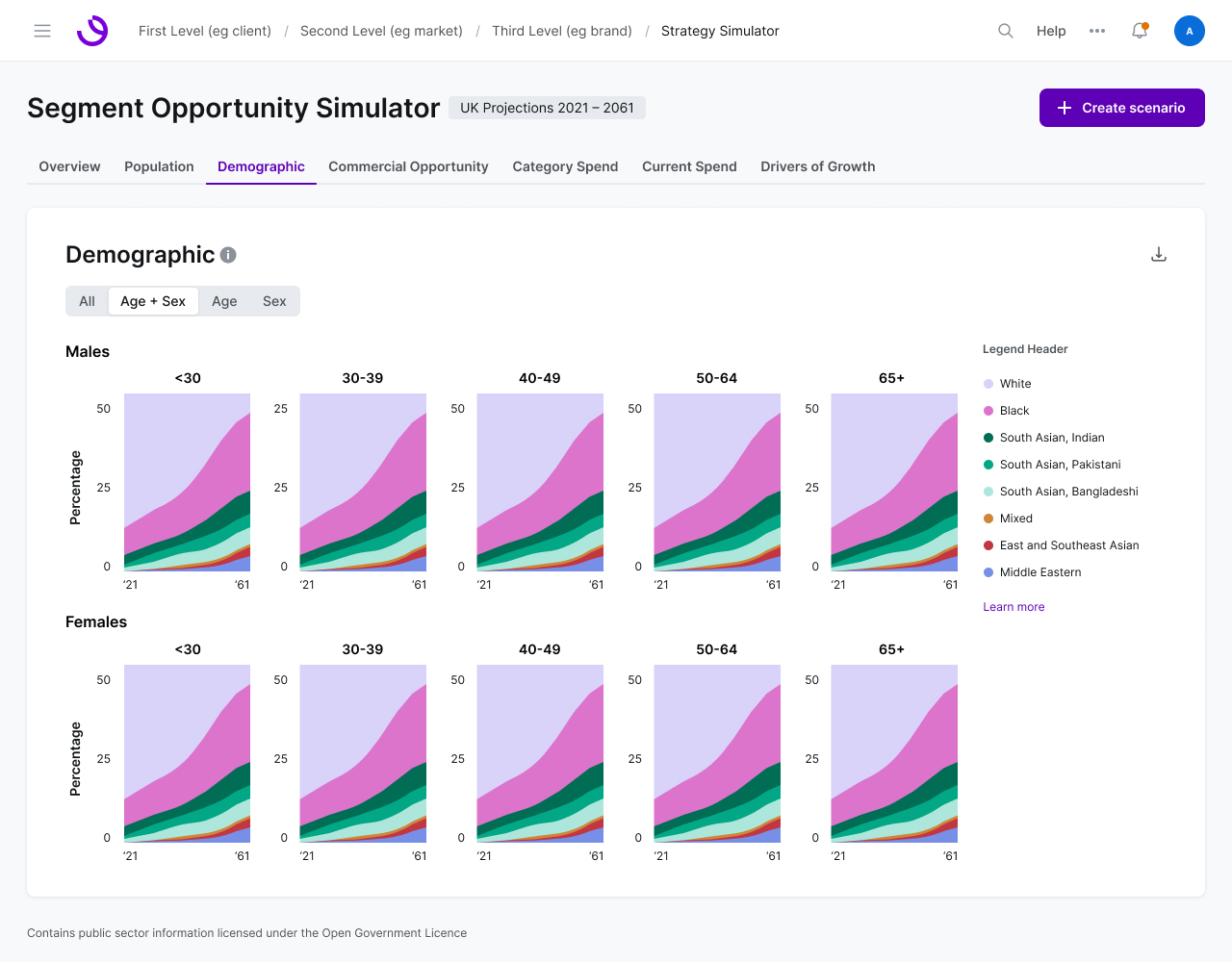
Age and sex demographic breakdown (placeholder data)
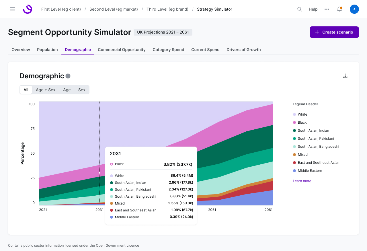
Demographic projection over time (placeholder data)
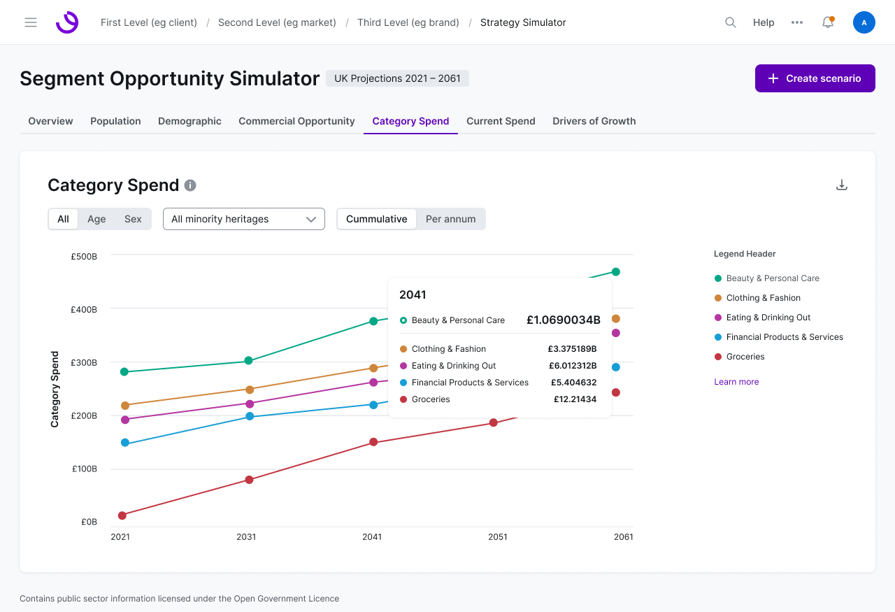
Category spend analysis (placeholder data)
4. Filter/Dropdown order and dependencies.
Speed and usability through intelligent sequencing
Working with Data Scientists, I mapped which filters depended on which, and what order they had to come in: category and subcategory, ethnic group, age, income, sex. That ordering had two jobs to do at once. It had to match how a strategist actually works through a brief, and it had to keep the cloud calls behind every query efficient. Getting it right is what kept the tool fast and reliable at scale.
Demographic filtering interface showing age, income, and sex breakouts in the US version (placeholder data)
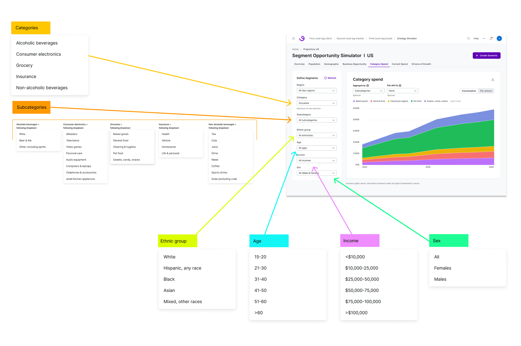
Filter dependency mapping diagram
5. Post-MVP scale-up to multi-select filtering.
Expanding flexibility for complex scenario building
Once the MVP was out, I led a significant UI and UX update that added multi-select and far more customizable combinations across categories, ethnic groups, age, income, and sex, particularly in the US version. It widened what you could actually ask the model, and it shipped with the US version of the tool, then we circled back and updated the UK version.
None of the before mentioned steps stand on their own. The product only came to life once all five were in place. The architecture decided how the story unfolded. The inventory decided what the story could say. The cumulative charts made growth legible at a glance. The filter dependencies kept the model answerable in real time. And multi-select opened it up to the questions people brought once they actually started using it. Take any one away and you're left with a data set rather than something a strategist can drive on their own.
Tradeoffs
Strategic constraints that defined the product
Guided sequence over free exploration. Tabs control the order, which means I decided it, not the user. You can't put population projections and category spend side by side. I made that tradeoff because a non-technical user dropped into an unstructured forecasting model doesn't explore, they bounce.
A fast tool over a flexible one. A fixed filter order kept the cloud calls efficient and the tool responsive at scale, but it meant strategists couldn't start wherever they liked. Someone thinking ethnicity first still has to begin with category. I accepted that friction because a slow forecasting tool doesn't get used at all.
Launch first, expand later. Shipping the MVP with single-select got the tool in front of clients months earlier, but meant early users couldn't ask combination questions. Once we saw what they wanted to ask, we added multi-select so they could slice the data in far more ways.
Scaling to Two Markets
UK launched 2022, followed by the US
The UK version launched in 2022 with projections running to 2061. The US followed with its own multicultural segments, its own projection range, and its own data sources. This meant the architecture of the tool had to scale because everything underneath it changed and would continue to. And it did!
Walkthrough of the US version of the Segment Opportunity Simulator
Impact
Billions reallocated, Atticus Award won
SOS became one of Choreograph's first offerings to new clients and major global brands. It helped shift media budgets for diverse audiences from roughly 3% to over 5% which makes up billions in reallocation. SOS played a real part in keeping and winning top advertisers in the US and UK. It also won the Atticus Award for original thinking within WPP's global network.
Why This One Stays With Me
Sequencing over visuals: turning a story into a self-service product
The design work that mattered most here wasn't visual. It was sequencing: which chart follows which, which filter unlocks which, which tab sets up the next. A story that had only ever worked with a presenter in the room had to work with nobody in the room at all, and that reframing is what turned a whitepaper into a product people paid for.