
B2C Product design · Media & Entertainment
History Vault: Streaming Video on Demand
HISTORY Vault · Lifetime Movie Club
Product Designer · HISTORY Vault: 1 year to launch across 5 platforms · Team: 4 designers, 6
engineers, 1 PM
Lifetime Movie Club: 6 months · Team: 3 designers, 5 engineers, 1 PM
The Problem
A+E had no subscription product
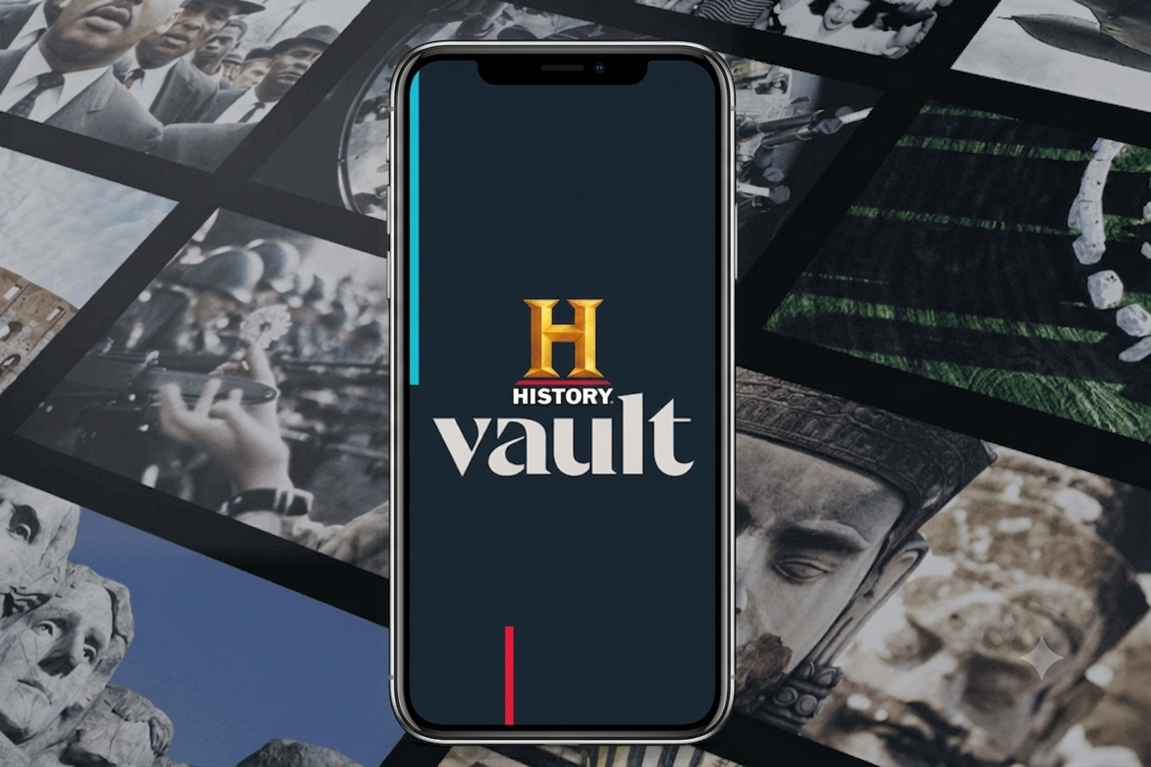
The business goal was to create HISTORY's first subscription video-on-demand product. There was no existing SVOD foundation to build on, no established patterns, and a hard commercial need to get to market.
The Constraint
Roku first, and fast
We needed HISTORY Vault on Roku quickly. So we gathered around a table and brainstormed what the OTT app should be and do. That speed requirement shaped everything: it meant designing for the most constrained platform first which was a TV remote, a ten foot interface with limited interaction at that time.
Launch
Roku, then everywhere
HISTORY Vault launched on Roku, then rolled out across five platforms: Roku, Apple TV, iOS, Android, and Web. Each brought its own conventions at the time of this design. Each had to feel native to its platform while remaining recognizably one product.
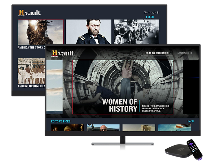
Roku TV interface
iOS
From ten feet to ten inches
The Roku design gave us a structure simple enough to work with, the remote and a directional pad. Rather than shrinking the TV layout onto a phone, I rebuilt browsing so a viewer moving from their phone to their TV never had to relearn the product.
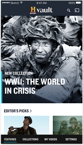
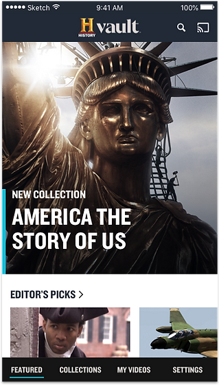
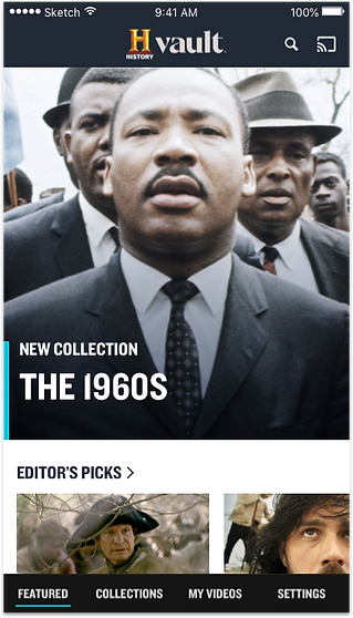
iOS app interface
Android
Native conventions, one product
Android users expected Android. At the time, I designed to Material Design conventions rather than mirroring the iOS app so the product felt native. The harder decision was balancing between platform native and brand consistent: the interaction patterns had to change, while the content hierarchy, structure, and identity stayed the same product across all five platforms.
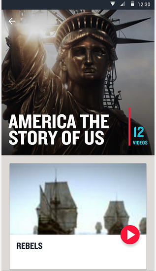
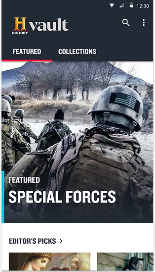
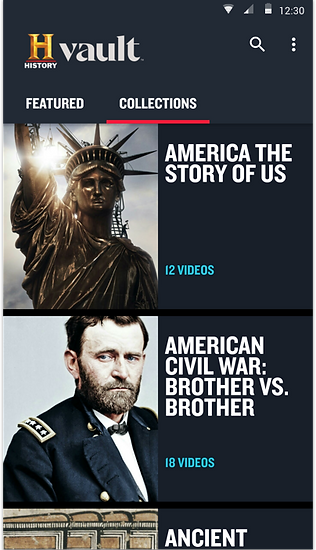
Android app interface
Web
One product, every screen size
I designed the web experience to reflow around the content rather than optimize for a single breakpoint: the same collections, the same hierarchy. The product stayed recognizably the same across every device.
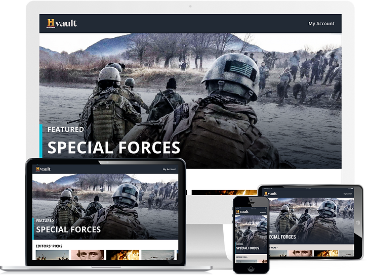
Responsive web interface for desktop and mobile browsers
Lifetime Movie Club
A second product, a different viewer
Within a year, Lifetime Movie Club was launched which was our second SVOD product across the same five platforms, built on the same foundation developed rather than from scratch. The same conventions, entirely different problem: where HISTORY Vault organized hundreds of hours of episodic documentaries, Lifetime Movie Club surfaced a library of exclusive movies for a different audience.
Building for a second brand tested the foundation: the shared platform conventions worked, but the brand identity, content hierarchy, and browsing patterns had to serve Lifetime Movie Club's audience and library structure differently than HISTORY Vault's documentary archive.
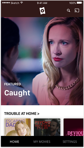
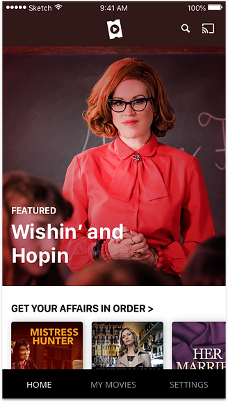
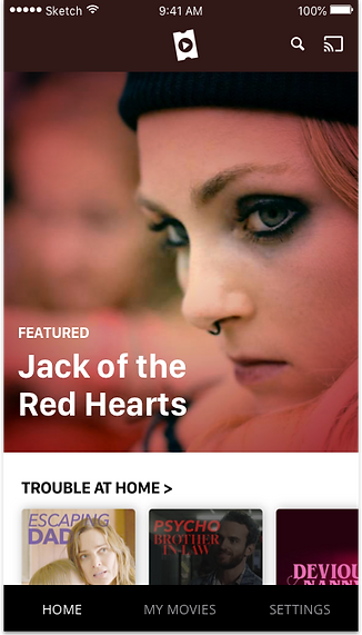
iOS app interface
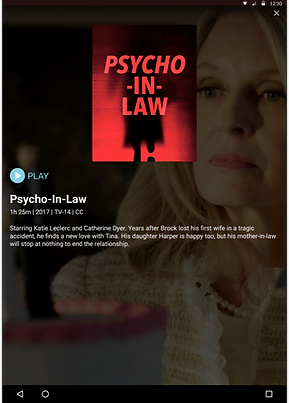
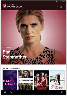
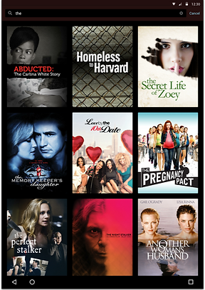
Android app interface
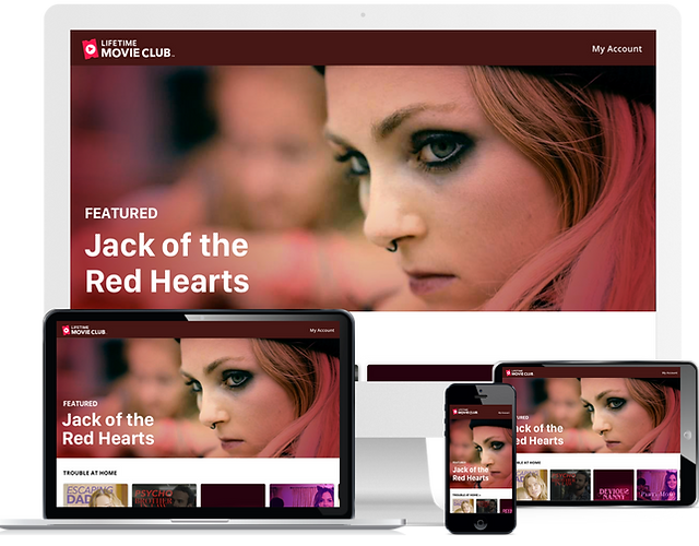
Responsive web design for all screen sizes
Outcome
Two subscription products, each running across five platforms. Ten platform launches in total. HISTORY Vault took a year to reach all five. Lifetime Movie Club took six months. Lifetime Movie Club shipped in half the time with a smaller team, because it didn't start from zero. The platform conventions, components, and patterns already existed. Both products are still live on all 5 platforms and are still being iterated on today.